TAP5 Aggregate Coverage Plots
Q: How can I create a shapefile from an Aggregate Coverage study to plot with HDMapper™?
A: For TAP 5.0.1028 systems with a Maintenance Subscription date of August 31, 2004, or later, Aggregate or Composite Coverage studies can be converted to shapefiles. These can be used with SoftWright’s HDMapper program or other software that reads the shapefile format.
Note that all values shown in this article are for illustration purposes only. It is important that you use good engineering judgment to determine the values that are appropriate for your equipment and specific application.
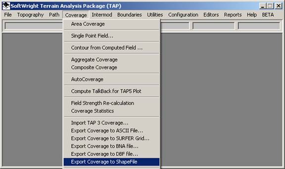
After you have completed the execution of the Aggregate or Composite study, click the Coverage menu in TAP and select “Export Coverage to ShapeFile:”
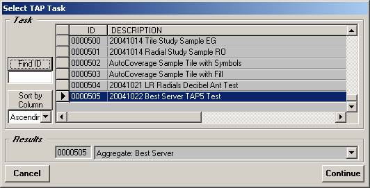
You will be prompted to select the Task created for the Aggregate study:
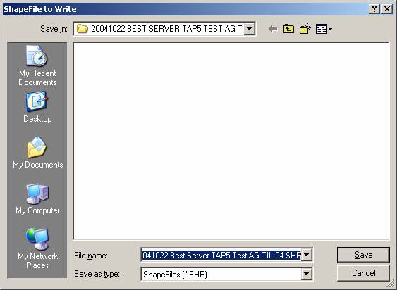
You will be prompted for the name of the shapefile to create. The default is created using the Task description you entered when you set up the study. A folder using this name will be created under the “MAPPING\MAP FILES” folder in the directory where TAP is installed:
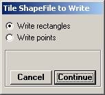
The shapefile can be written either as rectangles centered on each tile point in the study, or as a point symbol at each point. Select the type of shapefile you want to write:
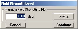
The plot will include the threshold field strength level to show. You can enter a value or use the Lookup button to open the Mobile Facility database to get a required field value to use in the plot:
As you will see below, the computed aggregate value at each location will fall into one of several categories:
□ Spec Not Met – The Aggregate Coverage specifications (such as the “Capture Margin” for a Best Server study) were not met, so the point is not usable.
□ Below xxx dBu – The value was below the “Minimum Field Strength to Plot” value entered here, so the point is not usable.
□ Task Description for the task that generated the value at this point. There will be one category for each of the tasks, and the Aggregate Coverage plot will show which computed coverage value was used for the point.
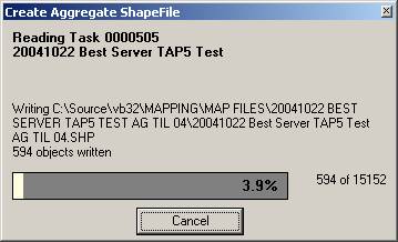
The shapefile will be created with each point assigned to one of these categories.
When you click Continue on the Field Strength Level form, the program will begin writing the shapefile:
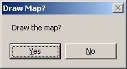
When the shapefile has been created you will be given the option to draw the map with HDMapper:
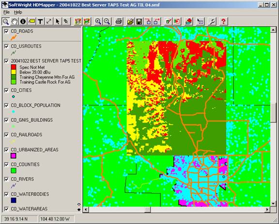
As an example, here is an Aggregate Coverage drawn with HDMapper:
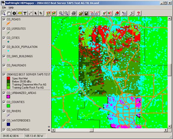
You can move the coverage layer up in the list (click on the legend entry and drag it up) to get a better view of the results.
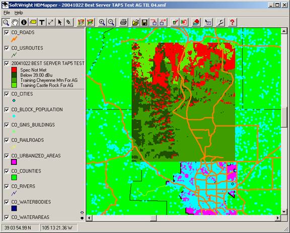
Note the categories shown in the legend. The first two (“Spec not met” and “Below 39dBu”) were described above.
The remaining categories in the legend are the descriptions of the Tasks included in the Aggregate study. This example shows two, but other Aggregate studies could contain more Tasks.
In this example, the red and dark green areas represent locations where service is not available, either because none of the included studies met the 39dBu requirement, or because the Capture Margin specification was not met.
You can see in the example, the two lighter green shades indicate areas of service from the two different sites.
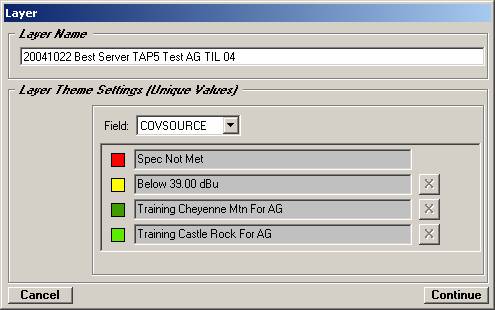
Like other HDMapper drawings you can control the legend settings. For example, if you double-click on the legend entry for the coverage study, the Layer form is displayed:
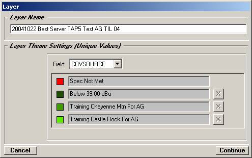
Since this is an Aggregate Coverage, the shapefile is plotted in TAP using the descriptions of the four categories as “unique values” in the shapefile. You cannot change the field level to be plotted here. If you want to see the same Aggregate Coverage study plotted using a different field strength level (for example, to show a different required field), you can create a different shapefile from the Coverage menu and specify a different level to plot.
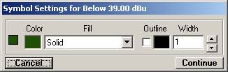
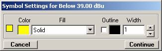
If you want to change the color or fill pattern for a category, double-click the colored symbol to the left of the category. For example, you can double-click the symbol next to the “Below 39.00 dBu entry. The Symbol Settings form will be displayed:
Click the Color symbol on the form and you can select the color you want to use:
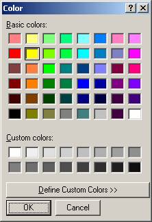
Click OK and the new color will be displayed:
Click Continue to return to the Layer form, showing the new color:
Click Continue to show the map with the new color settings:
For this example, the map indicates:
□ Red areas where there was adequate field strength (39dBu or higher) from one or both facilities, but the Capture Margin requirement was not met, so no service is available.
□ Yellow areas where there neither facility provided adequate field strength, so no service is available.
□ Light green areas where there was the Castle Rock facility provided adequate field strength (39dBu or higher) and the capture margin spec was met.
□ Dark green areas where there was the Cheyenne Mountain facility provided adequate field strength (39dBu or higher) and the capture margin spec was met.
Copyright 2004 by SoftWright LLC